Topology
The graph draws the same agents the table lists, arranged by how they reach the server. Use the Compromised Graph button in the Agents toolbar to switch to it.
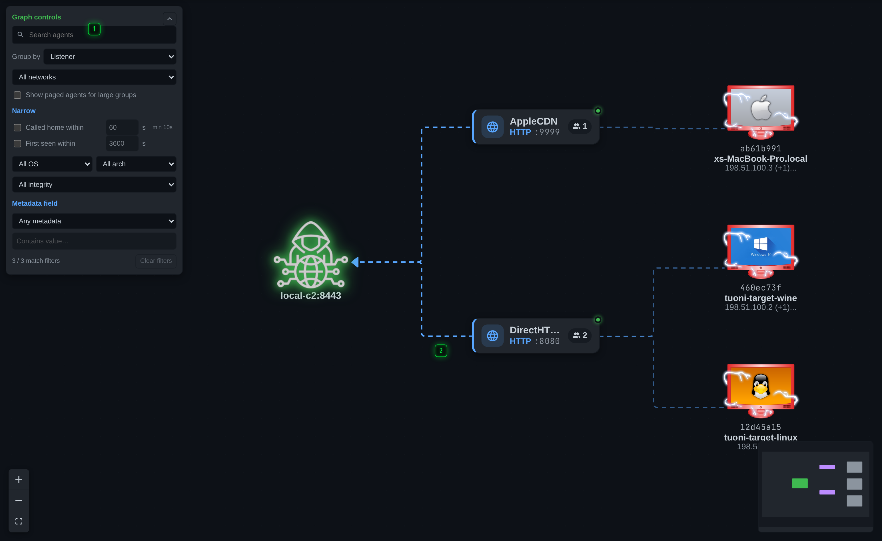
- Filters - which listeners, networks and states are drawn. The panel collapses when the pane is narrow
- Canvas - one node per agent, grouped by the listener it arrived through. Scroll to zoom, drag to pan, right-click a node for its actions
What the picture shows
Agents are grouped by the listener they arrived through, so a listener with thirty agents reads as one cluster rather than thirty rows. An agent that pivots through another - a relay, over SMB or TCP - is drawn attached to the agent it pivots through, which is the fact the table cannot show at all: in the table both are just rows, and nothing says that killing one takes the other with it.
Node colour and badges carry the same state the table's columns do: platform, privilege where the agent reports it, and whether the agent is overdue.
Moving around
- Scroll to zoom, drag to pan.
- Click a node to select that agent.
- Right-click a node for the same actions the table row offers, including the console and the file browser.
Filters
The filter panel narrows what is drawn - by listener, by network, and by state. On a narrow pane it collapses to a button; the graph is still filtered while it is collapsed.
The search box in the toolbar is shared with the table, so a term typed on one applies to the other. If the graph seems to be missing agents, look for the chip beside the search box that says how many are hidden.
When to use which view
The table answers "what do I have and what is it doing". The graph answers "how does this hang together, and what breaks if I lose this box". On a large operation the graph is also the faster way to notice a listener carrying far more agents than it should.